Visualizing Data in Apache Druid with the Plotly Python Library
Sep 11, 2023
Rick Jacobs
So, you’ve got data, now what? To make your data work for you it’s important to visualize and analyze that data. Data visualization is essential for analytics because it provides a clear and concise way to present complex data patterns and insights. In this blog, we will explore how to use the Python Plotly library to create visualizations of your Apache Druid data. I will show you how to connect to your Druid database using Python and execute SQL queries to fetch the data. Next, we will dive into the basics of data visualization with Plotly, including plotting graphs like pie charts and 3D scatter plots.
The Python Plotly Library
Python Plotly is a powerful library for data visualization and dashboards, making it an excellent choice for data scientists and analysts It supports a wide range of chart types, such as scatter plots, line plots, and bar charts. By connecting Python Plotly to your Druid data source, you can create dynamic visualizations. This combination allows for fast and efficient data exploration and analysis. The documentation and community support for Python Plotly is extensive, making it a popular choice among data scientists and analysts. Plus, Python Plotly’s integration with other programming languages, such as JavaScript and HTML, enables the creation of highly interactive dashboards. The open-source nature of both Druid and Python Plotly also ensures that you have access to a wide range of resources, such as blogs and GitHub repositories, for further learning and collaboration. Here are some factors to consider when choosing Plotly:
Interactivity: Plotly’s main strength is in creating interactive plots that can be used in Jupyter notebooks and web applications. If your project requires static graphs, another library like Matplotlib might be simpler to use.
Learning Curve: Plotly has a slightly steeper learning curve compared to simpler, less flexible libraries like Matplotlib and Seaborn. If you need to get up and running quickly and don’t need interactive features, you might prefer a simpler tool.
Customizability: Plotly charts are highly customizable, with control over almost every visual aspect of the chart. However, this can lead to more complex code compared to other libraries.
Online vs Offline Mode: Plotly supports both online and offline modes. The online mode allows for saving and sharing charts online, which can be very handy.
Community and Documentation: Plotly has robust documentation and an active community.
Export Options: Plotly provides flexibility in exporting your graphs in various formats including PNG, JPEG, SVG, and PDF.
Cost: Plotly is free and open-source for the basic library. However, advanced features such as Dash’s deployment server come with a cost.
Compatibility: Plotly can be used alongside Pandas, NumPy, and other Python scientific libraries, and it also plays nicely with Jupyter notebooks.
Quick Primer on Apache Druid
Effective data visualizations are not just about representing data accurately but also about doing so quickly. In interactive dashboards and analytical platforms, users expect to explore data without lag. Delays in loading or refreshing visualizations can impede the analytical process, leading to user frustration and potentially missed insights.
With Apache Druid’s capability to execute queries in sub-seconds, even across multi-billion-row datasets, it ensures that visualizations remain fluid and interactive. By providing swift access to underlying data, Druid empowers businesses to make faster decisions, recognize patterns in real time, and fully harness the power of their data through visual exploration.
Combining Druid with Plotly ensures that visual representations of data are swiftly delivered, enhancing the decision-making processes and overall end-user satisfaction. With the integration of these two technologies, users can create visually appealing and informative dashboards that allow them to gain deeper insights into their data at any scale.
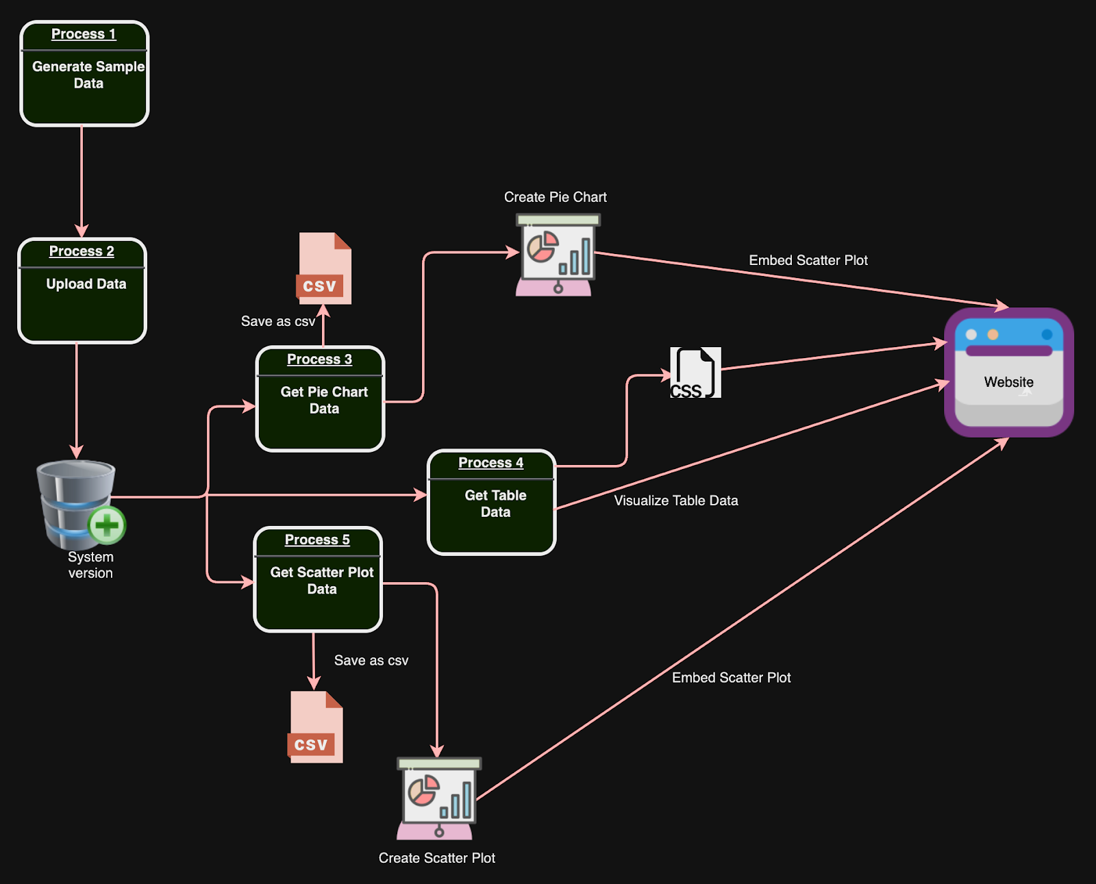
Data Flow Diagram
The Data Flow Diagram (DFD) below summarizes the flow of information for this solution and provides an overview of the processes.
Each step is supported by code to automate the required functionality. The flow chart can serve as your roadmap of the processes that make up the solution.
The Solution
Software development is generally an operation of breaking down the issue you want to solve into several processes which are building blocks for the completed solution. The challenge is gathering insights from data by using effective visualization techniques. To solve this issue, I created a Flask which is a lightweight Python web application framework. I then wrote HTML and Python code to accomplish the necessary tasks, following the steps outlined below.
Generate Sample Data
To start visualizing Druid data with the Python Plotly Library, you need to first install and setup Druid to store the data. To install Druid, you can refer to the official instructions here. Once Druid is successfully installed and properly configured, we can visualize the data using the Python Plotly Library.
First, let’s create some sample data to be used in this exercise. The code below generates and saves random sales data into a CSV file. The data includes information such as product category, units sold, cost, and revenue. The script uses the Pandas library to create timestamps for each entry in 15-minute intervals from June 1st to June 30th, 2023. The generated data is then written into a CSV file named “sales_data.csv”. There is also a function called “upload_data”, that handles uploading the CSV data to another system or database.
Python
import csvimport randomimport pandas as pdfrom upload_csv_data import upload_datadefgenerate_data(row_num,timestamp):# List of product categories product_categories =["Electronics","Fashion","Groceries","Automobile","Furniture"]# Randomly select a product category selected_category = random.choice(product_categories)# Generate random values for units sold, cost, and revenue units_sold = random.randint(10,1000) cost =round(random.uniform(10,1000),2) revenue =round(cost * units_sold,2)# Return the generated data as a listreturn[row_num, timestamp, selected_category, units_sold, cost, revenue]defgenerate_csv(timestamps):# Define the file path for the CSV file filepath ='/Users/rick/IdeaProjects/CodeProjects/druid_visualizations/data/sales_data.csv'# Open the CSV file in write modewithopen(filepath,'w',newline='')as file:# Create a CSV writer object writer = csv.writer(file)# Write the header row writer.writerow(["RowNum","Timestamp","Category","UnitsSold","Cost","Revenue"])# Loop through the timestamps and generate data for each timestampfor idx, timestamp inenumerate(timestamps,start=1):# Generate data for each row data_row =generate_data(idx, timestamp)print(data_row)# Print the generated data (optional)# Write the data to the CSV file writer.writerow(data_row)if __name__ =="__main__":# Generate timestamps for each 15-minute interval from June 1st to June 30th, 2023 timestamp_data = pd.date_range(start='2023-06-01',end='2023-06-30',freq='15min')# Call the function to generate and save CSV datagenerate_csv(timestamp_data)# Call the function to upload the CSV data to another system (not shown in the provided code)upload_data()
The dataset created represents sales information for different products captured at specific timestamps. Each row of data provides the following details:
RowNum: An identifier for each data row.
Timestamp: The date and time when the sales data was recorded.
Category: The product category of the item sold (e.g., Fashion, Automobile, Groceries, Furniture, Electronics).
UnitsSold: The number of units sold for the specific product at that timestamp.
Cost: The cost of each unit of the product.
Revenue: The total revenue generated from selling the specified number of units at the given cost.
For example, looking at the first row of data:
RowNum: 1
Timestamp: June 1st, 2023, at 00:00:00 (midnight)
Category: Fashion
UnitsSold: 938
Cost: $780.50
Revenue: $732,109.00
This means that at midnight on June 1st, 2023, 938 units of a product in the Fashion category were sold at a cost of $780.50 each, resulting in a total revenue of $732,109.00. The subsequent rows provide similar sales information for different products and timestamps, allowing for analysis of sales trends and performance over time. Here is a snapshot of the .csv data generated.
The code below automates the process of uploading the data. The script first sets up the command to upload data by specifying the file containing the data and the URL of the Druid server. It then changes the current working directory to where the Druid tool is installed. Next, it tries to execute the specified command to upload the data to Druid.
If the data upload is successful, the script prints a message indicating that the data has been loaded into Druid. This script streamlines the uploading process, making it easier for users to access, analyze, and visualize their datasets.
Python
import osimport subprocessdefupload_data(): cmd ='bin/post-index-task --file /Users/rick/IdeaProjects/CodeProjects/druid_visualizations/insert_config.json --url http://localhost:8081' druid_directory ='/Users/rick/IdeaProjects/druid_2600/apache-druid-26.0.0' os.chdir(druid_directory)try: output_message = subprocess.check_output(cmd,shell=True,stderr=subprocess.STDOUT)print(output_message.decode())print(f"Data loaded into Druid at http://localhost:8888/ according to /insert_config.json configuration.")exceptExceptionas e:print(f"Unexpected error occurred: {e}")if __name__ =="__main__":upload_data()
Query Druid and Create Visualizations
Now that the data has been loaded into Druid the next steps are to use code to execute queries to return the data for the visualizations and then render the visualizations on the website.
Writing SQL Queries for Druid
To execute SQL queries, you need to establish a connection to the Druid cluster using the Pydruid library. The process includes selecting desired columns, specifying filters or aggregations, and defining groupings or orderings.
Fetching Data from Druid Using Python
To fetch data from Druid using Python, you can utilize the `druidapi` library to interact with the Druid API. This allows you to retrieve the desired datasets for analysis and visualization purposes by executing SQL queries. Once you have fetched the data from Druid, you can leverage the Python Plotly library to create various types of visualizations such as line charts, bar charts, and scatter plots. These visualizations provide a comprehensive way to analyze and present the data obtained from Druid.
For this solution, I utilized a table, pie chart, and 3D Scatterplot visualizations. I followed the steps documented in the next section to create the table.
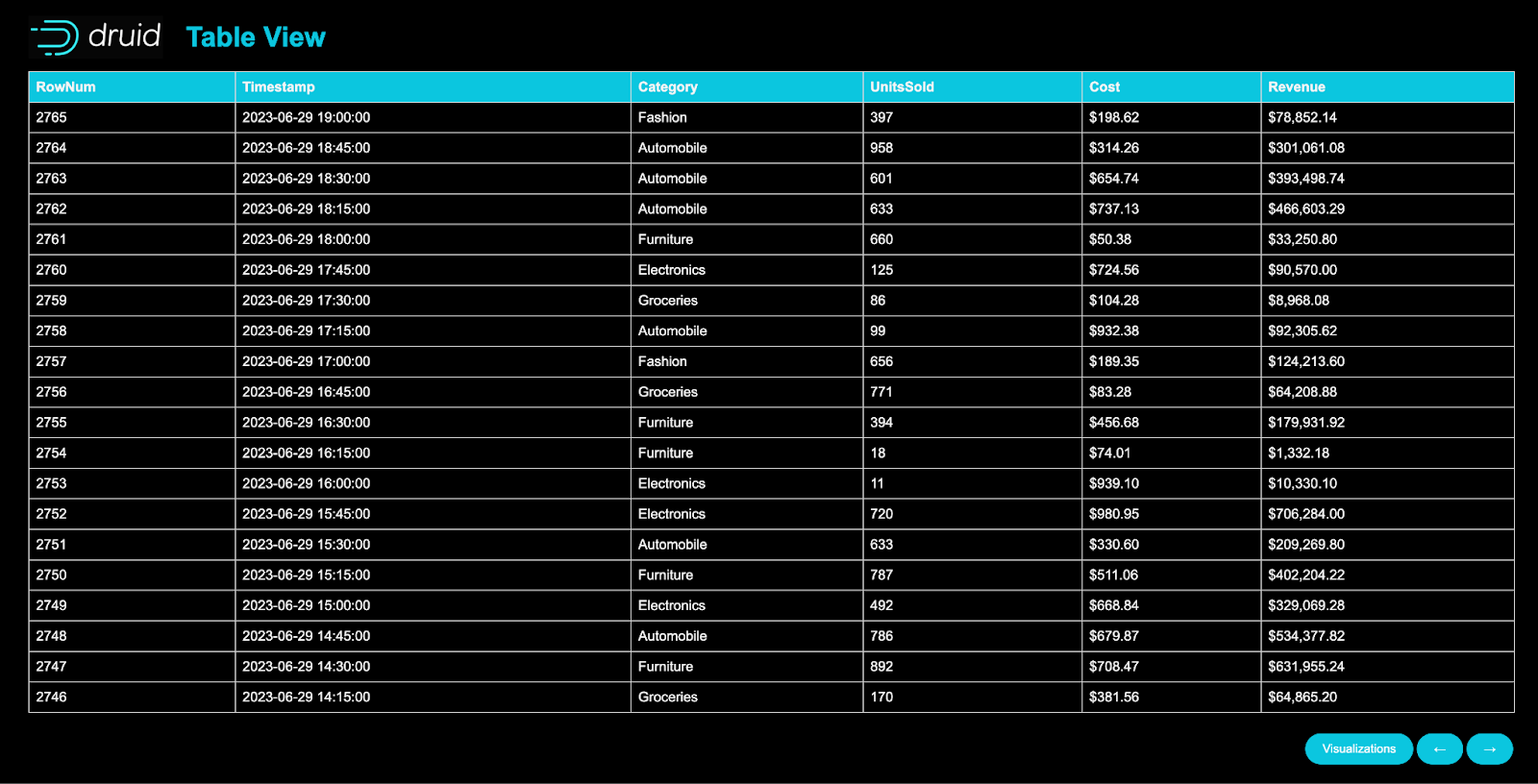
Create Table
This code is a web application built using Flask, to interact with the Druid database. The application provides a user interface to view and explore the sales data in a tabular format with pagination. When a user accesses the application, it sends a SQL query to Druid to fetch the sales data with the most recent sales first. The data is then formatted and processed using the Pandas library to display timestamps in a more readable format and convert cost and revenue values into dollars and cents. The application also includes a separate route for the visualization page, which I will discuss in a later section.
The Flask, app.py code can be seen below:
Python
from flask import Flask, render_templatefrom druidapi import client as druid_clientimport pandas as pdapp =Flask(__name__)API_URL ="http://localhost:8888"QUERY =""" SELECT * FROM sales_dataORDER BY "__time" DESC"""PER_PAGE =20# Adjust as needed, this will be the number of rows per page@app.route('/',defaults={'page':1})@app.route('/page/<int:page>')defload_page(page): druid =druid_client(API_URL) sql_client = druid.sql results = sql_client.sql(QUERY) data = pd.DataFrame(results)# Convert '__time' to a more human-readable format data['__time']= pd.to_datetime(data['__time']).dt.strftime('%Y-%m-%d %H:%M:%S')# Format 'Cost' and 'Revenue' columns as dollars and centsfor col in['Cost','Revenue']: data[col]= data[col].apply(lambdax:'${:,.2f}'.format(x))# Implement pagination start =(page -1)* PER_PAGE end = start + PER_PAGE page_data = data.iloc[start:end] total_pages =len(data)// PER_PAGE +(1iflen(data)% PER_PAGE else0) data_list = page_data.to_dict(orient='records')returnrender_template('table_page.html',data=data_list,page=page,total_pages=total_pages)@app.route('/visualization')defvisualization():returnrender_template('visualization_page.html')if __name__ =='__main__': app.run()
Below is the HTML (table_page.html) for the webpage that renders the table chart. This code creates a web page that displays data in a tabular format. The template is designed to showcase information fetched from a database with specific columns like “RowNum,” “Timestamp,” “Category,” “UnitsSold,” “Cost,” and “Revenue.” The web page contains a header with a logo and title, followed by a table with headers representing column names. Using a loop, the template populates the table rows with data fetched from a provided list. The template also includes pagination functionality with “Next Page” and “Previous Page” buttons to navigate between different pages of the table. There is also a button labeled “Visualizations” that, when clicked, will redirect the user to a different page to display related visualizations.
<!DOCTYPE html><htmllang="en"><head><metacharset="UTF-8"><metaname="viewport"content="width=device-width, initial-scale=1.0"><title>Table View</title><linkrel="stylesheet"type="text/css"href="{{url_for('static', filename='styles.css') }}"></head><body><divclass="container"><headerclass="header"><imgsrc="{{url_for('static', filename='druid_icon.png') }}"alt="Druid Logo"><h1>Table View</h1></header><table><thead><tr><th>RowNum</th><th>Timestamp</th><th>Category</th><th>UnitsSold</th><th>Cost</th><th>Revenue</th></tr></thead><tbody> {% for row in data %}<tr><td>{{row['RowNum'] }}</td><td>{{row['__time'] }}</td><td>{{row['Category'] }}</td><td>{{row['UnitsSold'] }}</td><td>{{row['Cost'] }}</td><td>{{row['Revenue'] }}</td></tr> {% endfor %}</tbody></table><!-- Page Navigation --><navclass="page-navigation"> {% if page < total_pages %}<ahref="{{url_for('load_page', page=page+1) }}"class="button right-button"title="Next Page">→</a> {% endif %} {% if page > 1 %}<ahref="{{url_for('load_page', page=page-1) }}"class="button"title="Previous Page">←</a> {% endif %}</nav><!-- Button to open visualization_page.html --><ahref="/visualization"class="button">Visualizations</a></div></body></html>
This page utilizes the styles.css file which is shown below:
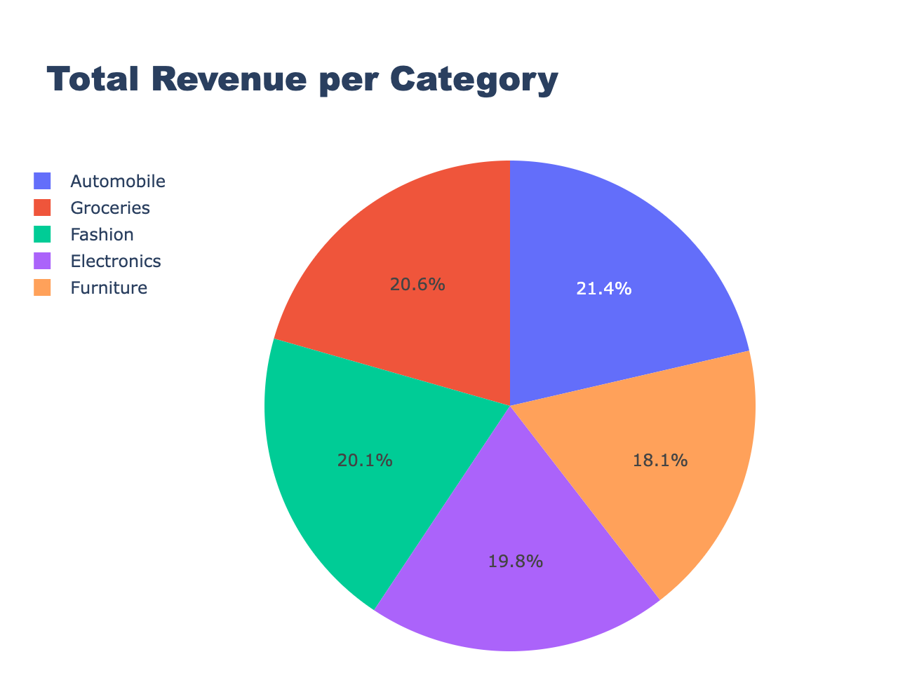
The code to create the Pie Chart, get_data_create_pie.py which is shown below, generates the visualization using Plotly and the Druid API. It fetches data from a Druid database through a specified API URL and SQL query, processes it, and creates a pie chart to represent the total revenue per category. The results obtained from the query are saved to a CSV file, which is then used to generate the pie chart using Plotly’s make_subplots function. The resulting pie chart is displayed and saved as an HTML file. The code is organized into several functions, each responsible for a specific task, such as fetching data from the Druid database, creating the pie chart, saving results to CSV, and saving the pie chart as an HTML file. When executed, the code produces a pie chart showing the total revenue per category and saves it as an HTML file, pie_chart.html which is shown on the visualization page.
Python
import csvimport pandas as pdimport plotly.graph_objects as goimport plotly.io as piofrom druidapi import client as druid_clientfrom plotly.subplots import make_subplots# API URL and file paths for data and visualizationAPI_URL ="http://localhost:8888"FILE_PATH ='/Users/rick/IdeaProjects/CodeProjects/druid_visualizations/data/results_pie_chart.csv'HTML_PATH ='static/pie_chart.html'QUERY =""" SELECT Category, __time, SUM(Revenue) AS TotalRevenue FROM sales_data WHERE __time >= TIMESTAMP '2023-06-01 00:00:00' AND __time < TIMESTAMP '2023-06-30 00:00:00' GROUP BY Category, __time"""# Function to save query results to a CSV filedefsave_results_to_csv(results,file_path): headers = results[0].keys()withopen(file_path,'w',newline='')as output_file: writer = csv.DictWriter(output_file,fieldnames=headers) writer.writeheader() writer.writerows(results)# Function to create a pie chart using Plotlydefcreate_pie_chart(df): fig =make_subplots(rows=1,cols=1) fig.add_trace( go.Pie(labels=df['Category'],values=df['TotalRevenue']),row=1,col=1) fig.update_layout(title={'text':'Total Revenue per Category','y':0.97,'x':0.5,'xanchor':'center','yanchor':'top'},legend=dict(orientation="h",yanchor="bottom",y=1.02,xanchor="right",x=1),autosize=False,width=1000,height=1000,margin=dict(l=50,r=50,b=100,t=100,pad=10))return fig# Function to save the pie chart as an HTML filedefsave_html_pie_chart(fig,html_path): pie_chart_html = pio.to_html(fig,full_html=False,include_plotlyjs='cdn')withopen(html_path,"w")as file: file.write(pie_chart_html)# Function to run the query and save results to a DataFramedefrun_query_and_save_results(): druid =druid_client(API_URL) sql_client = druid.sql results = sql_client.sql(QUERY)save_results_to_csv(results, FILE_PATH)return pd.DataFrame(results)if __name__ =="__main__": df =run_query_and_save_results() pie_chart =create_pie_chart(df) pie_chart.show()save_html_pie_chart(pie_chart, HTML_PATH)
Here is the code for the visualization_page.html which contains iframes for the pie chart and scatter plot.
<!DOCTYPE html><htmllang="en"><head><metacharset="UTF-8"><metaname="viewport"content="width=device-width, initial-scale=1.0"><title>Table View</title><linkrel="stylesheet"type="text/css"href="{{url_for('static', filename='styles.css') }}"></head><body><divclass="container"><headerclass="header"><imgsrc="{{url_for('static', filename='druid_icon.png') }}"alt="Druid Logo"><h1>Table View</h1></header><table><thead><tr><th>RowNum</th><th>Timestamp</th><th>Category</th><th>UnitsSold</th><th>Cost</th><th>Revenue</th></tr></thead><tbody> {% for row in data %}<tr><td>{{row['RowNum'] }}</td><td>{{row['__time'] }}</td><td>{{row['Category'] }}</td><td>{{row['UnitsSold'] }}</td><td>{{row['Cost'] }}</td><td>{{row['Revenue'] }}</td></tr> {% endfor %}</tbody></table><!-- Page Navigation --><navclass="page-navigation"> {% if page < total_pages %}<ahref="{{url_for('load_page', page=page+1) }}"class="button right-button"title="Next Page">→</a> {% endif %} {% if page > 1 %}<ahref="{{url_for('load_page', page=page-1) }}"class="button"title="Previous Page">←</a> {% endif %}</nav><!-- Button to open visualization_page.html --><ahref="/visualization"class="button">Visualizations</a></div></body></html>
This page utilizes the styles.css file which is shown below:
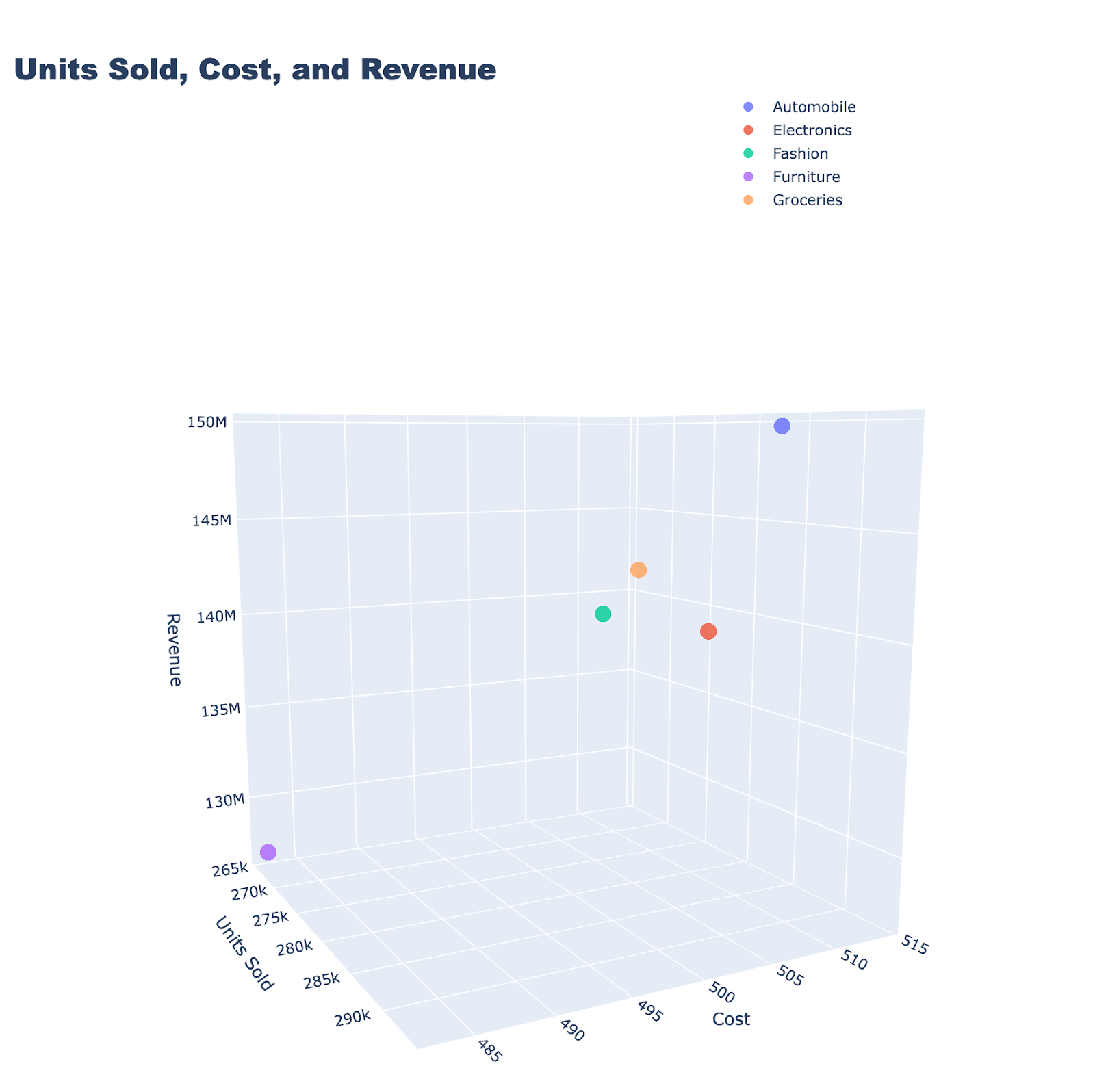
The code to create the Scatter Plot, get_data_create_scatter.py which is shown below, connects to the Druid database through an API URL, executing a SQL query to retrieve data about sales. The results are then saved as a CSV file. Using Plotly, the script creates a 3D scatter plot that visualizes the total units sold, average cost, and total revenue for each product category obtained from the query. The scatter plot is saved as an HTML file (scatter_plot.html) included on the visualization_page.html shown earlier.
Python
import csvimport pandas as pdimport plotly.graph_objects as goimport plotly.io as piofrom druidapi import client as druid_client# API URL and file paths for data and visualizationAPI_URL ="http://localhost:8888"FILE_PATH ='/Users/rick/IdeaProjects/CodeProjects/druid_visualizations/data/results_scatter_plot.csv'HTML_PATH_SCATTER ='static/scatter_plot.html'QUERY =""" SELECT Category, SUM(UnitsSold) as TotalUnitsSold, AVG(Cost) as AverageCost, SUM(Revenue) AS TotalRevenue FROM sales_data WHERE __time >= TIMESTAMP '2023-06-01 00:00:00' AND __time < TIMESTAMP '2023-06-30 00:00:00' GROUP BY Category"""# Function to save query results to a CSV filedefsave_results_to_csv(results,file_path): headers = results[0].keys()withopen(file_path,'w',newline='')as output_file: writer = csv.DictWriter(output_file,fieldnames=headers) writer.writeheader() writer.writerows(results)# Function to create a 3D scatter plot using Plotlydefcreate_scatter_plot(df): categories = df['Category'].unique() traces =[go.Scatter3d(x=df[df['Category']== category]['TotalUnitsSold'],y=df[df['Category']== category]['AverageCost'],z=df[df['Category']== category]['TotalRevenue'],text=df[df['Category']== category]['Category'],mode='markers',name=category,marker=dict(size=8,opacity=0.8),hoverinfo='text')for category in categories] layout = go.Layout(title={'text':'Units Sold, Cost, and Revenue','font':{'size':24,'family':'Arial Black'}},scene=dict(xaxis=dict(title='Units Sold'),yaxis=dict(title='Cost'),zaxis=dict(title='Revenue'),aspectmode="cube"# enforce equal aspect ratio),autosize=False,width=1000,height=1000,margin=dict(l=150,# Increase left margin to make room for legendr=50,b=100,t=100,pad=10),legend=dict(x=1,# Change these values to move legendy=1.5,orientation="v",xanchor="left",yanchor="middle"))return go.Figure(data=traces,layout=layout)# Function to save the 3D scatter plot as an HTML filedefsave_html_scatter_plot(fig,html_path): scatter_plot_html = pio.to_html(fig,full_html=False,include_plotlyjs='cdn')withopen(html_path,"w")as file: file.write(scatter_plot_html)# Function to run the query and save results to a DataFramedefrun_query_and_save_results(): druid =druid_client(API_URL) sql_client = druid.sql results = sql_client.sql(QUERY)save_results_to_csv(results, FILE_PATH)return pd.DataFrame(results)if __name__ =="__main__": df =run_query_and_save_results() scatter_fig =create_scatter_plot(df) scatter_fig.show()save_html_scatter_plot(scatter_fig, HTML_PATH_SCATTER)
Here is an example of the three-dimensional scatter plot produced:
What Have We Learned
Throughout this blog post, we’ve taken a deep dive into the world of data visualization using Python’s Plotly library and Druid. We began by briefly discussing the importance of data visualization and the key features of both Druid and Plotly, which make them indispensable tools in this domain. We then ventured into the practical application of these tools, exploring how to generate data and ingest it into Druid, and interacting with Druid using Python and SQL. We also walked through the process of creating a web application that allows us to display data in a tabular format and create intriguing visualizations like pie charts and 3D scatter plots.
Key Points:
The critical role of data visualization in analytics and decision-making
Druid’s capabilities make it suitable for high-performance analytics on large datasets
An overview of Python’s Plotly library, including its strengths and considerations for use
The process of generating sample data and uploading the data to Druid
How to interact with Druid using Python and SQL
Generating a table, pie charts, and 3D scatter plots using Python’s Plotly library to visualize the data in a Flask web application
Conclusion
In conclusion, the combination of Python’s Plotly library and Druid provides a powerful, flexible, and interactive platform for data visualization. This blog post aimed to provide a comprehensive guide for harnessing these tools, from creating and loading data, to generating intricate visualizations. The ability to transform raw data into meaningful insights is very important in today’s data-driven world. By leveraging the capabilities of Plotly and Druid, you can take a significant step in this direction. Remember, the journey of data visualization is filled with constant learning and experimentation. So, continue to explore, create, and innovate!
Next Steps
Imply Polaris, the fully managed version of Apache Druid, offers more powerful visualizations than those discussed in this blog. You can experience Polaris firsthand by signing up for a free trial. Use it to connect to your data sources or use a sample dataset to explore its many intuitive features.
About the Author
Rick Jacobs is a Senior Technical Product Marketing Manager at Imply. His varied background includes experience at IBM, Cloudera, and Couchbase. He has over 20 years of technology experience garnered from serving in development, consulting, data science, sales engineering, and other roles. He holds several academic degrees including an MS in Computational Science from George Mason University. When not working on technology, Rick is trying to learn Spanish and pursuing his dream of becoming a beach bum.
Other blogs you might find interesting
No records found...
Jun 16, 2026
Splunk Smartstore vs Lumi Loglake: Two Very Different Ways to Search Logs in Object Storage
One copies data back before it can be searched. The other queries it where it lives. Lumi Loglake lets Splunk teams query logs directly in object storage, including AWS S3, Delta Lake, Apache Iceberg, using...
Supercharging Schema-On-Read: Logs in Object Storage Don’t Need a Data Catalog
Machine data architectures are rapidly changing. As telemetry volumes continue to grow and as costs rise, organizations are increasingly moving logs and other machine data into object stores such as AWS S3....
Imply Lumi Loglake vs Splunk Federated Search for S3
Teams are increasingly moving log data into AWS S3 to reduce costs and extend retention. Both Lumi Loglake and Splunk Federated Search to S3 help you query data in AWS S3 to lower costs, however the two technologies...