What’s new in Imply Polaris – October and November 2023
Dec 07, 2023
Matt Morrissey
At Imply, our commitment to continually improving your experience with Imply Polaris—our real-time analytics Database-as-a-Service (DBaaS) powered by Apache Druid®—is evident in recent developments. Over the past weeks, we have concentrated on unlocking historical insights, advancing analytic capabilities, streamlining data pipelines, providing enhanced visualization options, and much more.
Quick Overview of Imply Polaris
For newcomers to Polaris, here’s a brief overview: Polaris kicks off with a Database-as-a-Service, powered by Apache Druid®. This service brings you all the performance advantages of Druid in a hassle-free, fully managed cloud environment. Think of it as the “easy button” for Druid, featuring built-in capabilities for seamless data ingestion and visualization. Within minutes, you can derive valuable insights from your data without the complexities of infrastructure setup. The same cloud database offers end-to-end data management, ensuring automatic tuning and continuous upgrades for optimal performance at every stage.
So, what’s new in store for you?
Unlock Historical Insights: Query from Deep Storage
Earlier this year, Druid introduced support for querying Druid’s Deep storage to avoid pre-loading aged data into its data nodes, extending its capabilities from low-latency analytics queries to also include cost-efficient high-latency queries. Now, querying from deep storage is also available with Imply Polaris.
With this new capability, Imply Polaris becomes a more comprehensive system, addressing the need for historical analysis that may arise in addition to or as part of a real-time use case. Leveraging resource isolation, Polaris offers a cost-effective solution for storing larger volumes of ‘cold’ data and handling less performance-sensitive, heavyweight queries without compromising the real-time workloads. Users can directly query segments from deep storage, eliminating, in many cases, the necessity for a separate data lake or S3 object store coupled with a query engine, such as Apache Spark or Presto, for ‘cold’ data analysis.
Consider a couple of scenarios where querying deep storage adds significant value to real-time analytics applications:
On-demand compute for ad hoc analysis: Query data beyond the retention period of the real-time cluster, providing a cost-effective solution for in-depth exploration of historical data, albeit with higher latency.
Exports and downloads: Integrate export and download features into your applications, enabling users to access and download large datasets or reports generated from historical data. This empowers users with valuable insights and a deeper understanding of trends, patterns, and historical performance.
Complex reporting: Run resource-intensive queries for in-depth reporting. While these queries may have higher latency than real-time ones, the cost savings and the ability to handle complex reporting tasks make it a worthwhile choice.
Query from Deep Storage with Imply Polaris is currently available in a closed beta. If you’re interested in participating, please contact us.
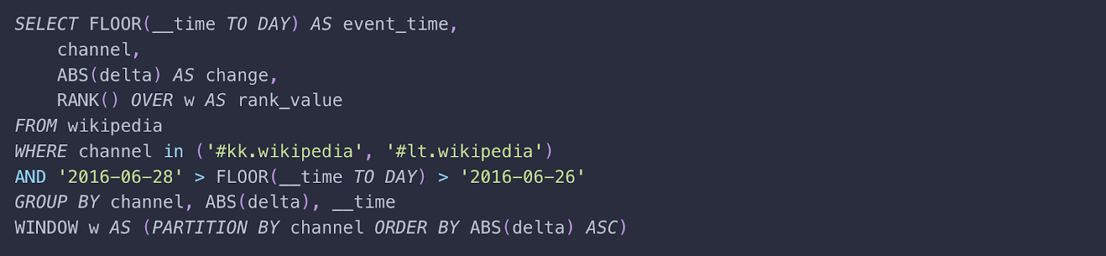
Richer Analytic Capabilities: Window Functions
The introduction of Window functions in Imply Polaris enhances its capabilities for real-time analytics and data exploration. This feature proves especially valuable when intricate calculations or analyses are required over a specific ‘window’ or subset of rows within a dataset.
Users now have the flexibility to easily perform complex computations. Tasks such as running totals, moving averages, and ranking to be executed seamlessly across specified ranges of rows—all within the familiar SQL framework. This eliminates the need for multiple queries or subqueries, streamlining the analytical process.
The use of window functions in this query provides the benefit of performing calculations and ranking based on a specific window of rows within the result set. In this case, the window function is applied to the RANK() function over the specified window w, which is defined as a partition of rows by the channel and ordered by the absolute values of delta in ascending order.
With the ability to conduct sophisticated calculations on datasets, users can extract deeper insights, make more informed decisions, and develop a more comprehensive understanding of their data.
Streamlined Data Pipelines: Ingest from Multiple Kafka Topics
Managing data pipelines from multiple Kafka topics just got easier with the latest enhancement to Imply Polaris. Now, you can efficiently ingest data from numerous Kafka topics through a single connection, streamlining your data pipeline management.
This advancement addresses the challenge of juggling multiple connections and simplifies configuration using regular expressions, particularly beneficial when dealing with numerous topics with low data volume. Developers can easily adapt to evolving data sources without unnecessary complexity, thereby enhancing workflows for real-time analytics applications.
By eliminating the need for multiple connections, this improvement not only saves valuable time and resources but also ensures a smooth and scalable data ingestion process.
Enhanced Data Pipeline Visibility: Kinesis Ingestion Metrics
Imply Polaris now offers enhanced visibility into your data pipelines through the Metrics export API, which incorporates Kinesis ingestion metrics. This integration provides users with real-time insights into the performance of their Kinesis jobs, including monitoring lag and ingestion throughput.
Users can promptly identify and respond to anomalies or issues in the ingestion process by configuring their alerts. For instance, real-time alerts can be triggered in cases of data ingestion delays (lag) or sudden drops in ingestion throughput. This enhancement contributes to maintaining a robust and reliable data pipeline, ensuring the continuous and efficient flow of data from Kinesis streams into Imply Polaris for real-time analytics.
Enhanced Data Exploration: Introducing Flat Table and Gauge Visualizations
Besides being a cloud database service, Imply Polaris provides a wide array of expressive visualizations for fast and interactive data exploration. Now, we’re excited to announce two additional options to elevate your analytical experience: Flat table and Gauge.
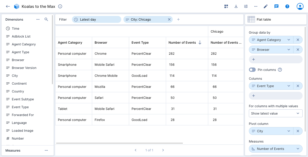
Flat Table Visualization
Similar to the traditional table visualization, the flat table presents flattened data, simplifying the representation of nested structures for a clearer and more accessible view. This feature caters to diverse data analysis needs, providing flexibility in choosing between table and flat table visualizations. The flattened view seamlessly integrates into reports and dashboards, enhancing the overall user experience.
Example: The table displays the Number of Events for City: Chicago in the Koalas to the Max data cube, grouped by Agent Category and Browser. The additional column, Event Type, shows the latest value when there are multiple values.
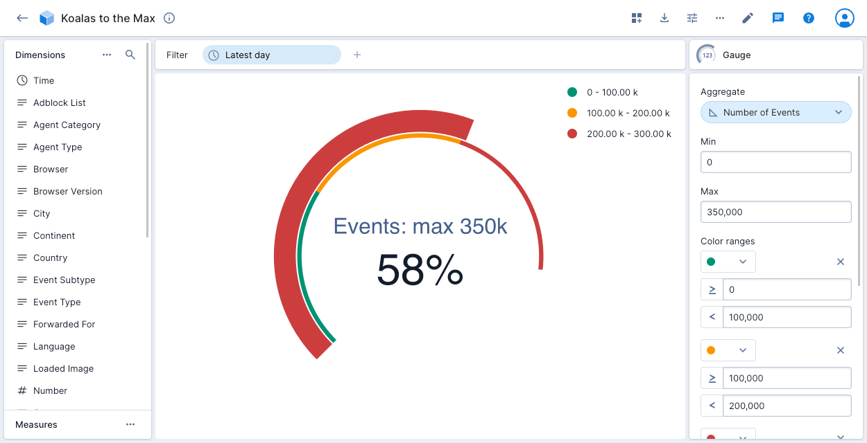
Gauge Visualization
The gauge visualization offers a visually intuitive method to summarize selected aggregates quickly. Key metrics are displayed in a concise gauge format, accelerating decision-making and data interpretation. The gauge can represent numbers or percentages, with customization options such as coloring specified ranges, setting custom labels, and displaying legends.
Example: The gauge illustrates the number of events in the Koalas to the Max data cube, proportionate to the maximum value of 350,000. The legend showcases three numeric ranges colored in green, orange, and red.
Elevate your embedded visualizations with the introduction of non-showable dimensions. This feature allows users to customize the display of dimensions based on relevance and importance, streamlining the presentation and improving the user experience.
For example, let’s assume Polaris is being used to deliver embedded analytics for an e-commerce platform. Sales managers access dashboards for key sales performance information, showcasing the top-selling products within each sales region. The visualization, presented as a bar chart, includes dimensions such as ‘Product Name’ and ‘Sales Region,’ with the measure being ‘Total Sales.’
To streamline the interface and maintain relevance for regional managers, non-showable dimensions like ‘Warehouse ID’ are designated. While information such as ‘Warehouse ID’ is crucial for supply chain management, it is not essential for the analysis of top-selling products. Therefore, it is designated as a non-showable dimension to streamline the interface and maintain relevance for regional managers.
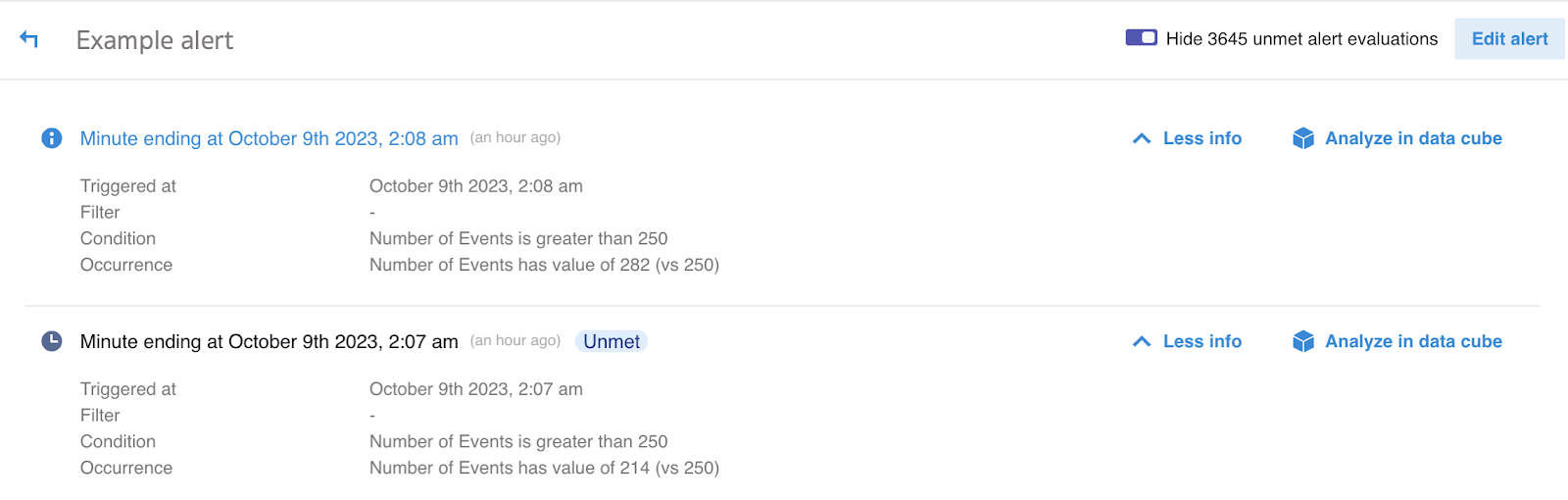
Monitoring events in your data with Imply Polaris has always been a powerful feature. You can set up alerts to track specific measures against configurable conditions, tailoring your notifications to suit your preferences and designating recipients for these alerts.
Now, we’re thrilled to introduce the ‘Unmet Alert Evaluations’ feature, enhancing transparency and diagnostic capabilities within our alerting system. This feature allows users to review instances where alert criteria were evaluated but did not trigger alerts due to specific conditions not being met.
In the example above, the ‘Example’ alert successfully triggered at 2.08 AM when the number of events reached 282, meeting the criteria of more than 250 events. However, during the 2.07 AM evaluation, the number of events was 214, resulting in the alert not being triggered. This feature provides users with a detailed insight into such evaluations, facilitating effective troubleshooting and optimization of alert configurations.
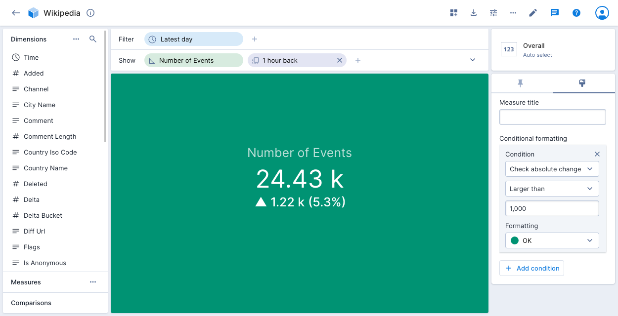
Updated Data Visualization: Conditional Formatting Upgrade
Imply Polaris has long allowed users to apply conditional formatting to overall visualizations with a single measure, using colors such as green for okay, amber for warning, and red for critical to indicate data severity.
Now, the capability has been enhanced further—you can create conditions based on comparisons. In the accompanying screenshot, the green visualization color signifies that the absolute change in the number of events for the previous hour was less than 1,000.
When you add an overall visualization tile with conditional formatting to a dashboard page, the colored icon next to the page name conveniently indicates the severity of the data on the page.
In Imply Polaris, a project serves as a fundamental unit, encompassing tables, data sources, files, jobs, visualizations, alerts, and reports.
To simplify project capacity management, the Metrics export API for Imply Polaris now delivers project_max_size_bytes and project_current_size_bytes project size metrics.
These insights offer detailed information supporting resource optimization, enabling users to make well-informed decisions about resource allocation and scalability strategies. Whether identifying underutilized resources or informing decisions about scaling, these metrics enhance the efficiency of project planning in Imply Polaris.
New projects in Polaris will now use SQL three value logic, providing a consistent and standardized approach to handling inequality operators. In SQL three-value logic, inequality operators only match rows with values explicitly not equal to the compared value, disregarding NULL values.
For instance, with the new behavior, a query like “SELECT * FROM my_table WHERE dim <> ‘some value'” will match all rows with values not equal to ‘some value,’ and NULL values will be ignored and not included in the query results. This adherence to the SQL standard ensures a clear and predictable behavior for developers working with Polaris.
Learn More and Get Started for Free!
Ready to explore these new features? Start your journey with a free 30-day trial of Imply Polaris – no credit card required! Or, take Polaris for a test drive and experience firsthand how easy it is to build your next analytics application.
If you have questions or want to learn more, set up a demo with an Imply expert. We’re here to help you make the most of Imply Polaris for your real-time analytics needs.
Other blogs you might find interesting
No records found...
Jul 24, 2026
Why You Shouldn’t Have to Delete Your VPC Flow Logs
When a security incident happens, investigators almost always start with the same questions: Which systems communicated? Where did the traffic originate? What changed before the incident? Was data exfiltrated?...
Splunk Smartstore vs Lumi Loglake: Two Very Different Ways to Search Logs in Object Storage
One copies data back before it can be searched. The other queries it where it lives. Lumi Loglake lets Splunk teams query logs directly in object storage, including AWS S3, Delta Lake, Apache Iceberg, using...
Supercharging Schema-On-Read: Logs in Object Storage Don’t Need a Data Catalog
Machine data architectures are rapidly changing. As telemetry volumes continue to grow and as costs rise, organizations are increasingly moving logs and other machine data into object stores such as AWS S3....