Streamlining Time Series Analysis with Imply Polaris
Jul 23, 2024
Larissa Klitzke
New capabilities for IoT and beyond
We are excited to share the latest enhancements in Imply Polaris, introducing time series analysis to revolutionize your analytics capabilities across vast amounts of data in real time.
Before we dive into these updates, a quick overview for those new to Polaris: Imply Polaris is a hassle-free, fully managed cloud environment that serves as the “easy button” for Apache Druid®. This database-as-a-service brings you all the performance advantages of Druid, plus add-in auto-scaling capabilities for seamless data ingestion, and an easy interface to build analytics applications that can be customized to visualize your time series data in real time. Within minutes, you can derive valuable insights from all your data without the complexities of procuring and managing infrastructure.
Time Series Use Cases & Challenges
Starting with the basics, a time series is a sequence of events collected at successive points in time, typically expressed at uniform intervals. Analyzing time series data helps businesses track changes over time to identify trends and make predictions to maintain stable operations, drive business growth, reduce expenses, and optimize experiences.
Time series analysis is relevant for a broad range of use cases across IoT, gaming, finance and other industries. For example, time series analysis is used in finance for stock price prediction and risk management, helping investors make informed decisions. In manufacturing, it optimizes supply chain operations by forecasting demand and managing inventory levels. In IoT applications, it analyzes data from sensors like thermostats and manufacturing monitors to predict equipment failures and optimize energy consumption.
While compiling data for time series analysis might seem straightforward, it’s actually quite complicated in practice. There are two main factors to consider:
Storage Optimization: Efficiently managing and storing vast amounts of time series data without overwhelming the storage infrastructure is no easy feat. From an architectural perspective, we often see companies collecting time series data and metadata in two separate systems — e.g. time series database (TDSB) or key-value database (KV store) for time series data vs. online transaction processing (OLTP) or document sore for metadata. Storing data in multiple systems not only increases the price of storing that data, but also introduces challenges for accurately combining and working with the data. As the cardinality and volume of time series data grows, this creates additional complexity and performance overhead for real-time analysis.
Operational Complexity: Working with time series data is inherently difficult. For instance, if you have one time series for ‘temperature’ and another for ‘humidity’ and you want to compute the 5-minute average humidity per degree of temperature over the course of a day, writing the SQL statement for such an operation is extremely complex. These queries often require nested subqueries, complex joins, and aggregations that are difficult to write, debug, and optimize. This becomes increasingly challenging when it comes to filling anomalies and gaps in the data due to sensor errors, transmission issues, or other factors.
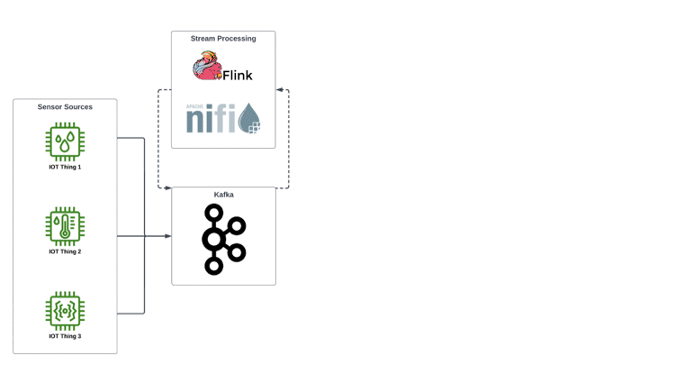
Time series data processing flow without vs. with Imply
Overview of Time Series Updates for Imply Polaris
That’s why we’ve introduced time series aggregation for Polaris. This feature works at persist-time to significantly reduce the data footprint of time series data and also reduces operational complexity by introducing mission-critical solutions for time series functions and visualization:
Time Series Algebra: Aggregate and analyze time series data by leveraging functions that operate directly on the time series: such as ADD, DELTA, DIVIDE, MAX_OVER, MULTIPLY, QUANTILE_OVER, SUBTRACT and SUM_OVER. This reduces operational complexity by making it easier to write queries in fewer steps, enhancing the overall efficiency of time series analysis.
Interpolation: Estimate the values of missing data points at regular intervals in the time series, unlocking the ability to fill data gaps, smooth irregularly sampled data, and capture various complex patterns. This is a game changer for time series analysis, because it directly addresses critical issues related to data continuity, quality, and usability, which are essential for accurate and comprehensive analysis.
Area under the curve analysis: Leverage functions like Time-Weighted Average (TWA), a statistical measure that calculates the average of a set of values while giving different weights to each value based on its duration or time period. When combined with interpolation, TWA can make it easier to recognize patterns, detect anomalies and resolve critical factors for predictive maintenance.
There are numerous applications for how these functions can be leveraged, combined and visualized, whether for real-time alerts or deeper analysis. To understand how they work in practice, check out the following mini demo or read on to dive deeper into an IoT scenario.
Demo Video: IoT Time Series Analysis with Imply Polaris
How Polaris Solves Time Series Challenges
Imagine you work for a Smart Grid provider that is focused on optimizing energy distribution across ever-changing supply and load demands. Your goal is to enhance transmission and distribution efficiency and prevent outages while integrating renewable (but sometimes unreliable) energy sources seamlessly into the grid. With thousands or millions of IoT sensors deployed across your infrastructure, you face challenges in managing vast amounts of time series data to monitor energy consumption, predict maintenance needs, and ensure grid stability.
To contextualize these challenges, let’s say you’re working with three separate data sources:
Some of your supply is coming from a neighborhood solar farm, which reports generated power from each of four inverters every 15 minutes. For this case, we generate data points with “source”: “solar”, a timestamp, lat/long, farm_id, inverter_type, inverter_firmware_version, incoming_current, output_AC, inverter_temperature, ambient_temperature
More supply comes from the grid via two different generation suppliers, with a measurement arriving every minute. For this data, we generate data points with “source”: “grid”, a timestamp, supplier_id, intertie_id, incoming_phase_frequency, incoming_AC, output_AC
We also have smart meters installed for all of the housing units that we are delivering power to, these report every 5 minutes from commercial power customers and 60 minutes for residential. This data would have a “source”: “consumer”, “consumer_type”: “residential”/”commercial”, and other fields timestamp, consumer_id, lat/long, meter_id, meter_type, meter_firmware, ambient_temperature, consumed_wattage
With other systems, the first reaction is to try to model each of these data sets in their own independent table. Because they are independent schemas, this adds to operational overhead and complicates queries, as each new source of data or integration source is likely to add yet another table that needs to be managed. This is where the power of auto-detected schemas shines: We can very simply add all of this data into the same table and just let each source have its own independent schema.
1. Drive Speed-to-Value with Time Series Aggregation
Challenge: As your business scales, understanding data from thousands or millions of sensors across separate systems becomes increasingly burdensome. This results in significant performance issues, especially when attempting to view aggregated information across all assets or combining assets across locations. Without a real-time, scalable solution, it becomes nearly impossible to derive timely insights from sensor data in order to monitor and manage energy consumption patterns.
Solution: Time Series Aggregation enables data aggregation at various intervals, such as minutes or hours, significantly enhancing query performance to manage energy flows in real time. Polaris makes it easy to run fast queries with aggregates and roll-ups while preserving access to every granular event.
Example: Let’s start by creating a time series for power demand with a DOWNSAMPLED_SUM_TIMESERIES() function. If we want to show demand every hour in the first half of 2024, we can use:
Here, we are using downsampling, which totals the data collected during each time period (in this case, 1 hour, using the ISO 8601 designation of ‘PT1H’). Note how in this one query we will get the combined values across all residential and commercial consumers, regardless of if there are 10 or 10 million consumers.
But it may be inaccurate, as, in real life, not every message from every sensor successfully arrives where it should. This means that some of the values we’re summing will be zero, which will give us a demand total that is lower than it should be. That’s where interpolation comes in.
2. Resample, Unsample & Handle Missing Data with Interpolation
Challenge: Data from IoT devices doesn’t always arrive reliably, so there are occasional gaps or other irregularities in the data stream, producing challenges when analyzing data. If the missing entries are treated as “zeros”, then it will produce incorrect results in analysis.
Solution: Interpolation estimates the values of missing data points in the time series. Interpolation can be used to resample or upsample the time series to a higher frequency, making it easier to analyze or compare with other time series sampled at different rates. Whether filling gaps in sensor readings, smoothing irregularly sampled data, or capturing complex patterns, interpolation enhances the reliability of insights derived from IoT data, contributing to more informed decision-making processes.
Example: While Imply supports multiple options for interpolation, the most common choice is linear interpolation, which fills in data gaps with a common mathematics function.
SELECT Meter_id, LINEAR_BOUNDARIES( TIMESERIES("__time", "ambient_temperature", '2024-01-01T00:00:00.000Z/2024-07-01T00:00:00.000Z'), ‘PT1H’ ) as demand_kwhFROMtableWHERE source ='consumer'GROUP BY meter_id
Here, we are using linear interpolation to get an hourly indication of the ambient temperature across all of the meters at the “minute boundaries” (the 00 second of every minute).
3. Combine Signals with Time Series Processing Functions
Challenge: Sometimes, you may have multiple IoT sensors or devices measuring different aspects of the same phenomenon or process. For example, you may have different sensors to measure voltage, current, temperature, load, power quality, supply and demand.
Solution: By adding or subtracting time series data, you can combine these signals to get a more comprehensive representation of the overall system or process.
Example: Comparing two IoT data streams can aid in anomaly detection or fault analysis. In this case, we want to compare supply with demand to be sure we aren’t running low, and risking blackouts or brownouts.
WITH solar as( SELECT LINEAR_INTERPOLATION(DOWNSAMPLED_SUM_TIMESERIES("__time","AC_POWER",'2024-01-01T00:00:00.000Z/2024-06-30T23:59:59.999Z', 'PT1M'),'PT1H') as supply_kwh FROM SOLAR_GENERATION )SELECT ADD_TIMESERIES(solar.supply_kwh,LINEAR_INTERPOLATION(DOWNSAMPLED_SUM_TIMESERIES("__time","AC_POWER",'2024-01-01T00:00:00.000Z/2024-06-30T23:59:59.999Z', 'PT1M'),'PT1H') as supply_kwh FROM GRID_SUPPLY )
From here, we can use SUBTRACT_TIMESERIES() to subtract demand from supply to get a time series that shows how much buffer power (or deficit) we have for each hour.
While the use cases above were focused on a hypothetical IoT scenario, you can check out this blog to explore a real example of how Inowatts was able to simplify utility management.
Time series analysis is also applicable to numerous other industries across IoT and beyond. Here are a few more concrete examples that may be relevant for your business:
Gaming: Identifying peak playtimes to optimize server loads; tracking player progression to personalize in-game rewards, bonuses and push notifications; and optimizing game economies by detecting inflation deflation, exploits, etc.
Manufacturing: Maintenance scheduling (via monitoring of machine temperature, vibration, pressure, etc.), production optimization (speed, material usage, energy consumption, etc.), supply chain management, etc.
Medical devices: Performance tracking (e.g. temperature, usage cycles, and error rates for MRI machines) and predictive maintenance (e.g. gradual increase in ventilator motor temperature might indicate impending failure).
Connected Vehicles: Fleet management (monitoring vehicle location, speed and fuel to optimize routes and improve fleet efficiency), predictive maintenance, driver behavior analysis, battery management in EVs.
Facilities: Building energy management (HVAC, lighting, etc. optimized by usage), occupancy and environmental monitoring, security and surveillance.
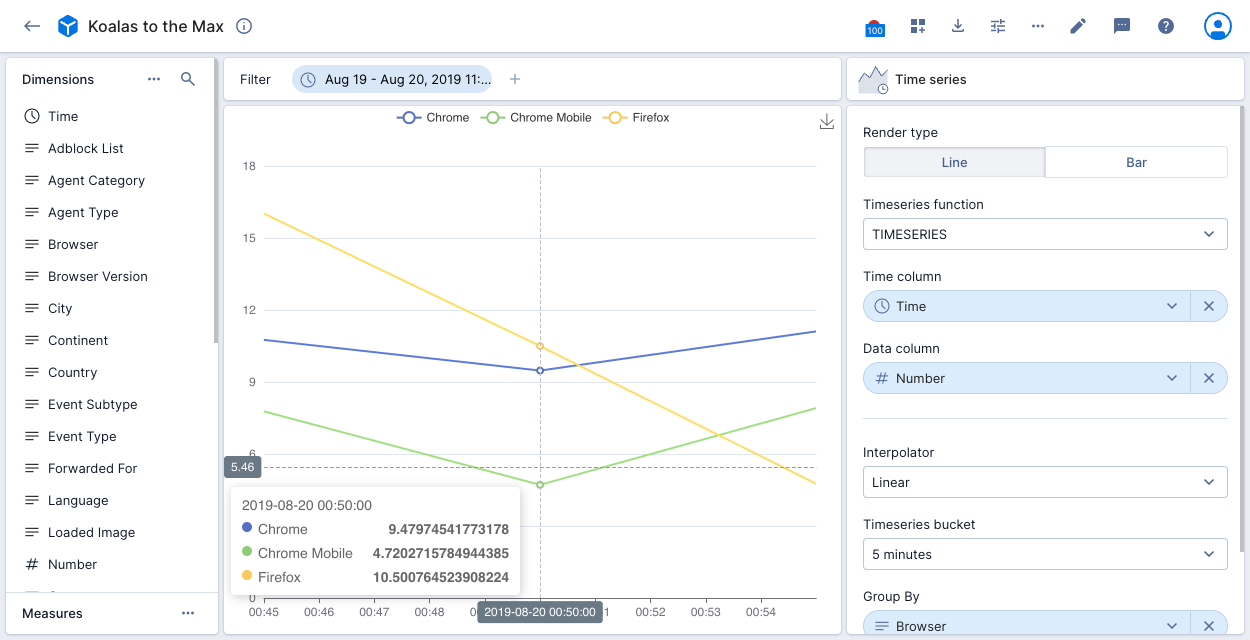
This example visualization applies the TIMESERIES function by filtering the data to a specific period. The time column on the x-axis is Time, with Number shown on the y-axis. The data is grouped by Browser. The visualization displays the top three browsers with the largest number of events. There’s a point on the chart for every 5 minutes as set in the time series bucket.
Start Your Journey with Imply Polaris
Whether you’re new to time series analysis or trying to optimize current processes, we’re here to help.
If you have questions or want to learn more, set up a demo with an Imply expert. We’d love to help you make the most of Imply Polaris for your real-time analytics needs.
Other blogs you might find interesting
No records found...
Feb 25, 2026
Imply Lumi Product Preview: Removing the Cost–Performance Tradeoff in Observability
If you caught our recent product update, you’ve already seen the pace of development on Imply Lumi has been relentless. Last quarter, we delivered major performance and usability improvements to data...
Since releasing Imply Lumi in September 2025 as a decoupled data layer for observability, the Imply R&D team has been hard at work to make it easier and more economical to retain, query, and analyze observability...
The Most-Read Imply Blogs of 2025 (and what they signal for 2026)
Before we take on 2026, let’s rewind. 2025 was the year observability teams stopped asking, “How do we reduce data?” and started asking the real question: “How do we build an architecture that can keep...