Temporal and real-time data have always been the cornerstones of Apache Druid, making it a natural fit for IoT applications that collect and analyze real-time sensor data. However, there was a subset of functionality that was available in other time-series databases that was missing from Druid. With the recently released time series extension from Imply, that gap has been closed, and Imply now has the ability to perform advanced time series analysis.
Although the time series functionality is documented here, I will explore how Polaris users can leverage this extension to facilitate and speed up their analysis.
Thermostat
Let’s begin with a simple home thermostat. To save bandwidth, this thermostat will only report its temperature when there is a change. So if your house is at 70 degrees Fahrenheit for 3 hours, and then goes to 69 degrees, it will only send one data point.
If we were to visualize this data, bucketing by hour and looking at the average temperature, we would end up with a graph that looks like this.
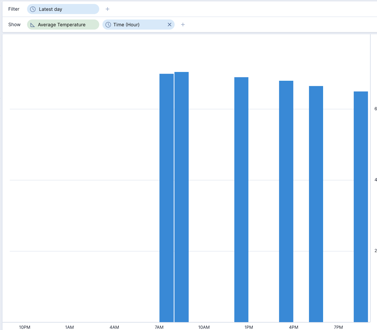
While that doesn’t tell a very great story, this is where the ability to interpolate time series data comes into play.
How interpolation works
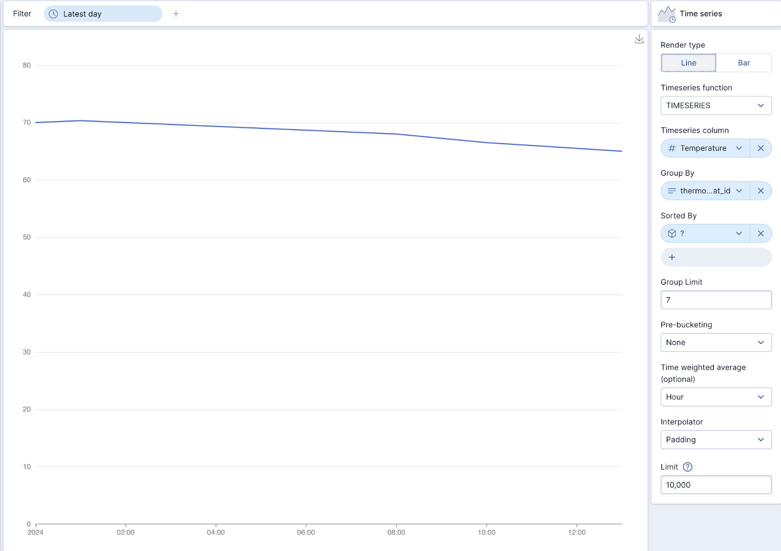
Polaris supports three types of interpolation: linear, backfill, and padding.
Linear Interpolation: This method assumes that the change between two known data points is linear. It simply draws a straight line between these points and uses this line to estimate missing values.
Backfill Interpolation: This method fills missing values using the next known value.
Padding Interpolation: This technique fills missing values with the last known value.
By using a time series visualization, we can interpolate the same data, but provide a much more intuitive visual representation.
If you’re not using Polaris, you can also use SQL to query the time series data, as below.
select
    TIMESERIES_TO_JSON(PADDING_INTERPOLATION(TIMESERIES("__time", "temperature", '2024-01-01/2024-01-2'),'PT1M')) as timeseries_json
from "thermostatData"
Power meter
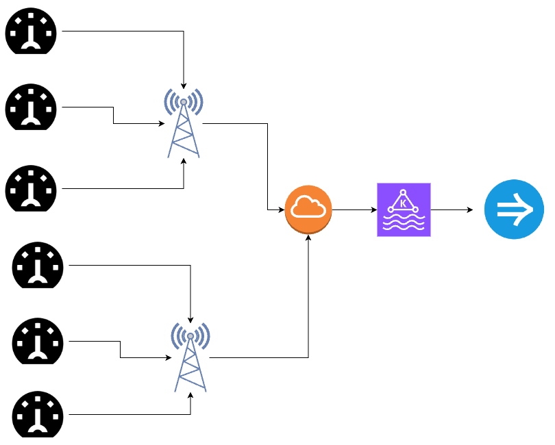
For this example, let’s take a look at an energy provider that has equipped every consumer on their network with a smart meter that transmits consumption data.
| Time | meter_id | kWh |
| 2024-01-01 12:00 | 1 | 1000 |
| 2024-01-02 12:00 | 1 | 1024 |
| 2024-01-03 12:00 | 1 | 1059 |
| 2024-01-04 12:00 | 1 | 1083 |
| 2024-01-05 12:00 | 1 | 1108 |
| 2024-01-06 12:00 | 1 | 1130 |
| 2024-01-07 12:00 | 1 | 1166 |
The challenge with this data is that it is a counter, meaning each day is a cumulative sum of the kWh consumed to that point. If we were to graph the data it would look like this.
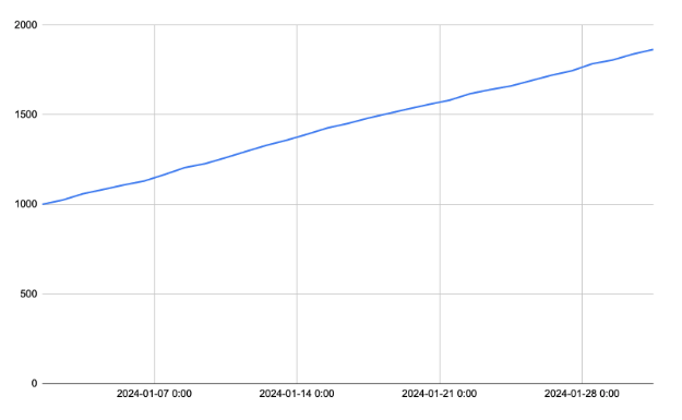
However, what we really would like to know is how much energy per day was used.
In SQL, we can use the LAG window function to compare one day to the previous day.
with daily_avg as (select FLOOR("__time" to day) as "__time",
      meter_id,
      AVG(kwh) kWh
from "powerMeterData"
where meter_id = 1
group by 1,2)

SELECT
    "__time",
    kWh - LAG(kWh, 1, 0) OVER (PARTITION BY meter_id ORDER BY "__time") AS daily_kWh_consumed,
FROM
    daily_avg
This is complicated, and difficult to build a visualization for. Instead, it’s much easier to use Polaris’ built-in time series capabilities.
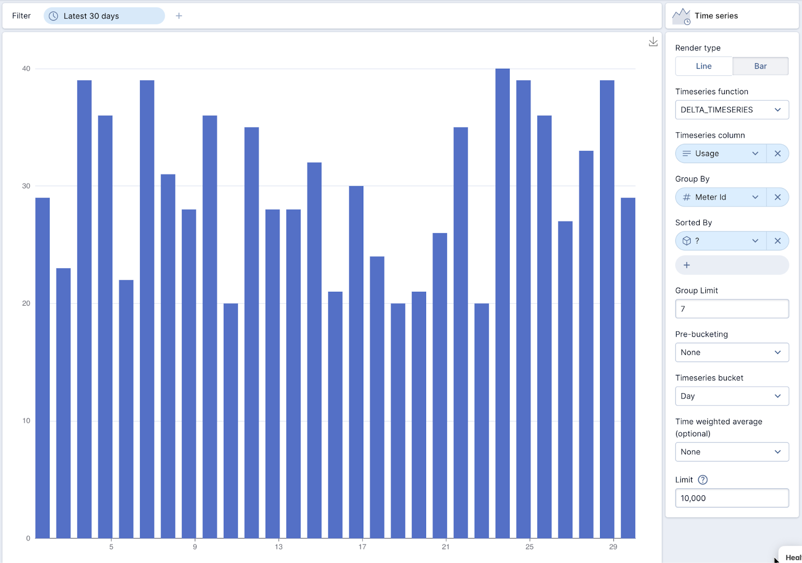
Using time series functions
Using Polaris, we can select the time series visualization, and using the DELTA_TIMESERIES function, we can quickly and easily visualize the delta of each day vs the previous day. Not only is this method easier, but it is also much more efficient.
Conclusion
Although the time series functions are still very new, they are very powerful and can make working with temporal data much easier and faster. Imply Polaris further simplifies the evaluation of IoT data with features such as powerful dashboarding, embedding, and alerting.
For the easiest way to get started with Apache Druid, sign up for a free trial of Imply Polaris today.
 Architecture
 Deployment
 Ingestion
 Modeling
 Operations
 Development


